This feature gives the container a fixed minimal size. It is fully responsive, which means the size will be relatively the same on desktops, tablets and smartphones (as long as the content inside is not larger than the container size you choose).
How to use the container size:
Step 1:
Click on the container and choose "Edit".

Step 2:
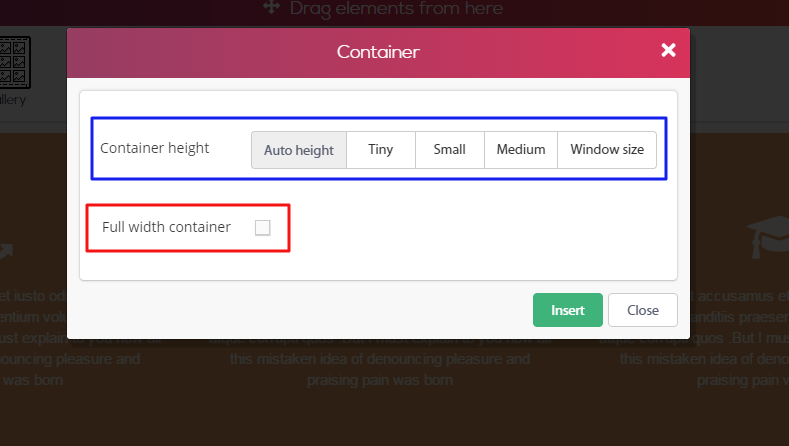
The "Container" window will open. Inside the blue square you can choose the minimal fixed height of the container. Inside the red square you can choose for the container to be on full width.
Example for use:
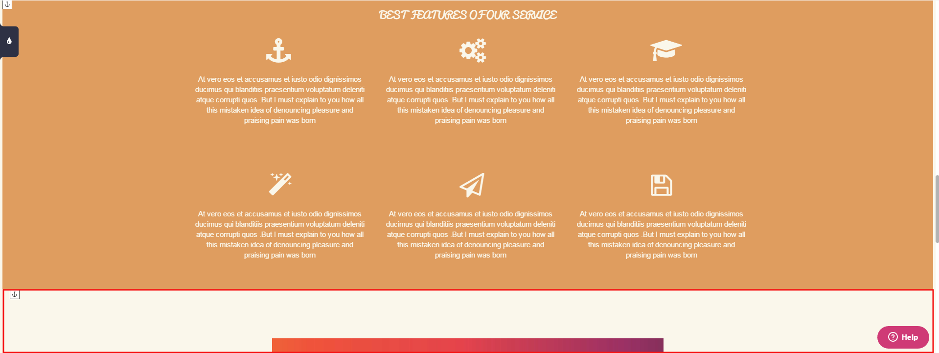
Let's say you want a background picture in the size of a whole window, but what you have now is a color background that is not in window height, as shown below. The red rectangle represents the gap needed to be filled in order to make our container in the desired height.
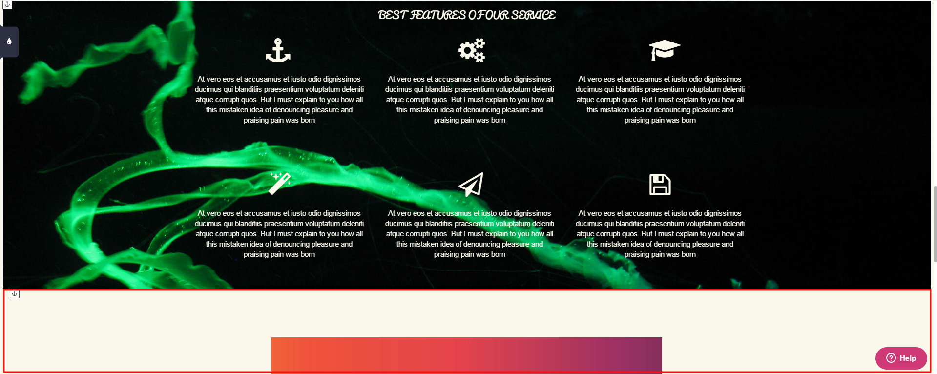
We will add a photo as the container background. As you can see, the background has been changed to be a photo but it's not in window size. There is still the gap. (red square)
In order to make this container fit to window height, click on the container and choose "Edit".
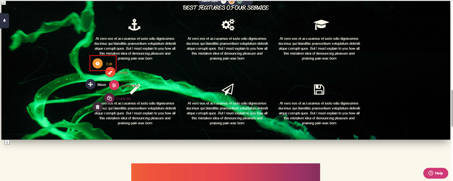
Choose "Window Size".
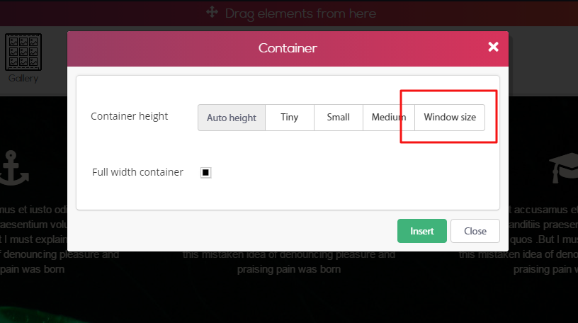
The container will change itself to fit full window size, and the gap we had previously will be gone.

Comments