Please make sure you are on pro mode before trying to use these guide features.

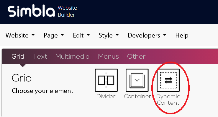
Dynamic Content: This element is critical for creating and using a master page.

When you design a master page, you are creating a template or pattern that will repeat itself in every page that is linked to it by checking the "Use Master Page" box.
To add additional content in each webpage, we must be sure to save some free space for the images and other elements that will only be relevant to specific pages (or page types). This element defines the space limitations in all pages linked this specific master page.
In order to define an editable area, you must add the Dynamic Content element.
Please note! The option of inserting this element is only available when building the master page.
The element can be dragged to designated locations on the page. When you drag this element through the page, it will look like this:

When you apply the master page design to new pages, the location of the Dynamic Content element will be where you can add different elements in different pages, such as text, images, video, HTML, etc.
Under the Grid menu there are two additional elements that can be found both in standard pages and in master pages. You can find a clear explanation about these elements in Simbla's video guide. Watching this video is highly recommended. To watch the video, click here.
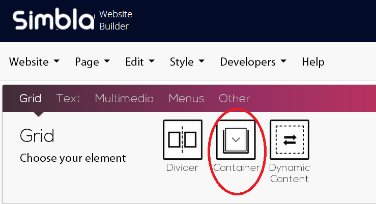
- Container
Simbla's websites are responsive, or in other words, they automatically adjust themselves to any screen size. The Container's role to contain other elements, and adjust their sizes accordingly. When we insert elements into the Container, the elements' sizes will stay fixed until the screen size reaches a critical point (at which the elements must be resized and relocated in order to keep the design quality). This critical point, as set as default at 1200 pixels. This means that when the site is displayed on a tablet / mobile device, or if its windows is resized but stays more than 1200 pixels wide, the content inside the container will not be resized, but only the margins. However, if the screen is resized to under 1200 pixels wide, the display will reduce its size and fit itself to the current screen size. You can edit the Container's width in pixels or percentage, background color etc.

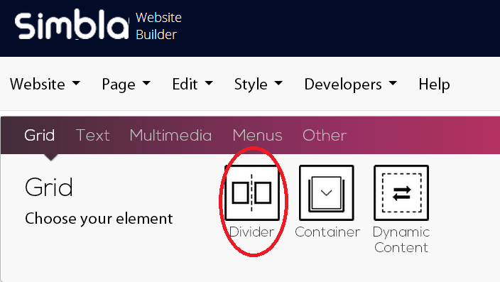
- Divider
This element defines how the screen will be divided. Here you need to set the number of columns that will divide your content between them.
How does it work? The screen is divided into 12 virtual columns. When you design your website, you must decide upon each element's size (length and width). The width of the element is defined by the number of columns we set (for example, an element that consists of 4 columns out of 12 will use a third of the whole screen). The height of the element is defined according to the amount of content you want to present. This technology enables your website responsivity – when elements (such as a picture or text) are resized relative to the screen, and do not maintain a fixed size. For example, if a picture covers a third of your computer screen, it will also cover a third of your mobile device screen, since it will be resized automatically.

How to do it?
Drag the Divider element wto the desired location on the webpage.
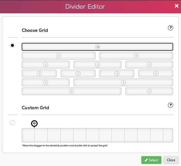
After the element is placed, the following window will display, where you can define the way you want the page divided:

- At the top of this window, you are presented with ready-made templates for the page division.
- Selecting "Custom Grid" will allow you to choose your own division: Drag the cursor to the desired location of division, and double-click to split.
Click "Select" to add the Grid division. Now you can use the columns to place your elements.
To read about the Text tab and to continue to the next page, click here.
Comments