This tab makes it easier (by using Media Queries) to control your website elements' design when moving from one screen size to another. You can also control the menu's "collapse point".
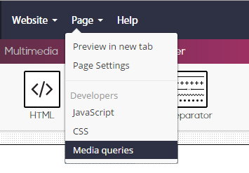
Clicking the "Responsive" tab will open the following screen, in which you will see three sections, each representing a Media-Query command that Simbla generates automatically.
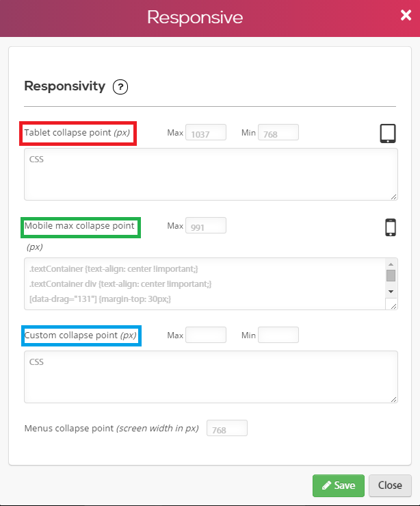
The numbers in each section represent the width of the screen in pixels:
The first section contains default values for tablets.
The second section contains default values for mobile devices.
The third section is for your manual customization.
Please note! You can modify default values as well.
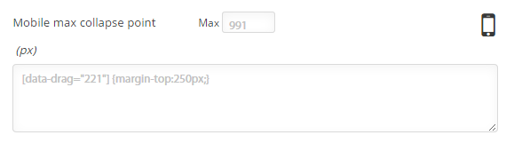
You can embed the CSS command in the same way you embedded code in the CSS tab. For an explanation how to embed code via the CSS tab, click here. For example, you can set a command that will increase an element's distance from the upper margins (to 250 pixels), when a screen width of 991 pixels is reached (as mentioned, this screen width is set as the default value typical to a mobile device screen):
Now, by viewing the various screen sizes found on Simbla's toolbar, we get the following result:
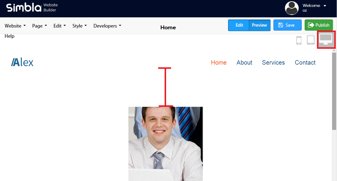
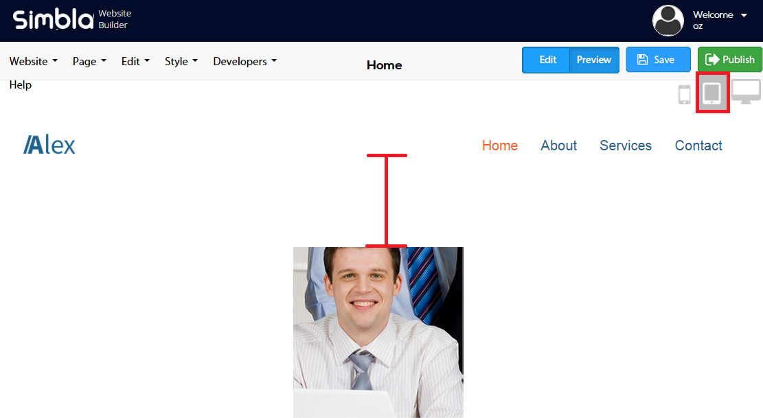
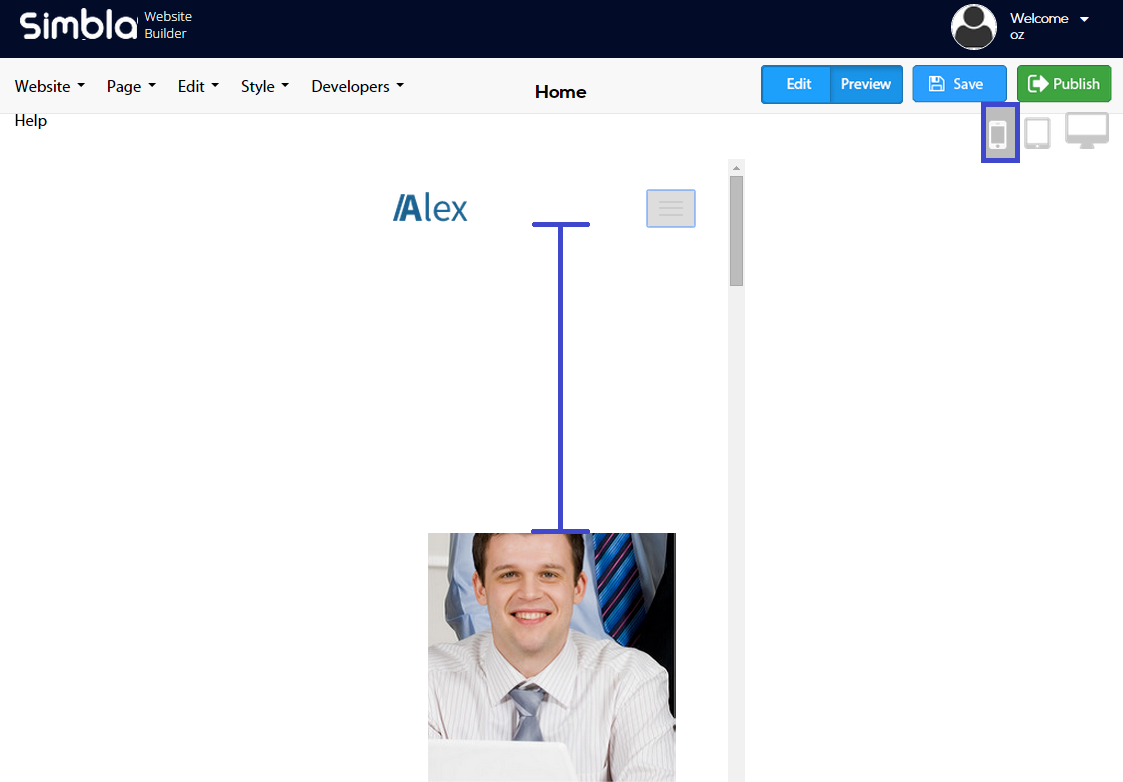
You can see that if we move to a screen width of 991 pixels, the distance between the element and the image increases based on our settings.
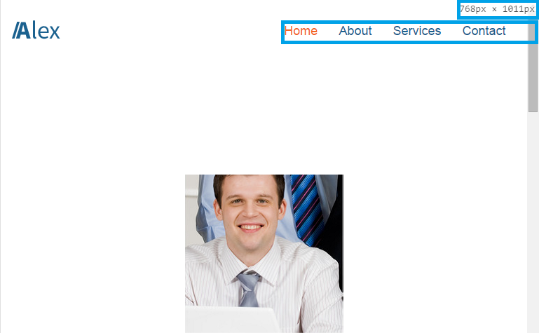
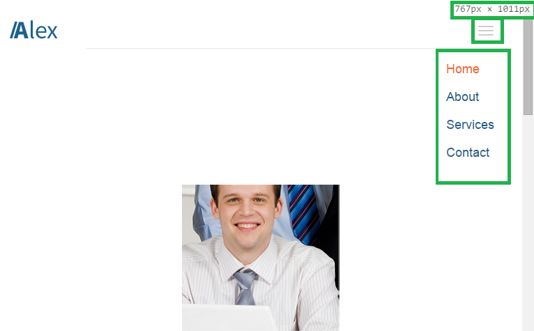
Another option under the "Responsive" tab is to control the menu's collapsing point, which will also change the menu icon to a "hamburger" shape.
You can of course edit the value of the screen width that will cause the menu to collapse.
For example: we will define the collpasing point to 768 pixels, and receive the following result:
Comments